Thursday, December 13, 2012

Hurricane Rita

In the 2005 hurricane season, Hurricane Rita was the fifth major hurricane recorded. Lasting from September 18 to September 26 of 2005, Rita first formed in the Bahamas as a result of a tropical wave that developed off the coast of West Africa. The storm formed on the 18th in the Gulf of Mexico, but it wasn't until September 24th that it made landfall between Sabine Pass, Texas and Johnson Bayou, Louisiana. By September 26th, Rita had weakened into a large low-pressure area over the lower Mississippi Valley.

The effects of this storm were pretty substantial. It hadn't even been a month since the infamous Hurricane Katrina had hit, and Rita old made the effects Katrina had on Louisiana worse. In fact, because Rita hit so soon after Katrina, a record-breaking 2.5 to 3.7 million people evacuated from the Texas coastline in preparation. Rita left areas of Texas and Louisiana without power for several weeks, and resulted in a total of $12 billion in damage. And that number is reported in 2005 US dollars; the damage would have amounted to about $15.2 billion in 2012 US dollars. On top of the material damage, as many as 120 deaths across 4 different states were reported. Texas reported 113 of these deaths. While only 7 were directly related to the hurricane (caused by winds, flooding, tornadoes, storm surges, or oceanic effects), all were in some way related to the storm.


This image shows Hurricane Rita as it starts to make its landfall on the Gulf Coast on September 23, 2005.
(http://www.nasa.gov/vision/earth/lookingatearth/h2005_rita.html)


This image is a storm track map of Hurricane Rita's entire progression.
(http://www.lawrencevilleweather.com/storms/2005/atlantic/rita.html)


This final image shows damage done by Hurricane Rita to Cameron, Louisiana.
(http://www.philip-lutzak.com/weather/Meteo%20241/PROJECT_1%20Hurricane%20Rita.htm)


Sunday, October 21, 2012

Longitudinal Differences


The pins on this Google earth picture show five cities, all about between 10 and 18 degrees longitudinally. The data below shows the differences in sunrise and sunset times, as well as in high and low temperatures.


Sunrise and Sunset Times on October 22, 2012 (West Africa Time):

Oslo, Norway: Sunrise - 8:14 am Sunset - 5:48 pm

Prague, Czech Republic: Sunrise - 7:36 am Sunset - 5:57 pm

Tripoli, Libya: Sunrise - 7:17 am Sunset - 6:26 pm

Bangui, Central African Republic: Sunrise - 5:30 am Sunset - 5:30 pm

Windhoek, Namibia: Sunrise - 6:14 am Sunset - 6:59 pm


High and Low Temperatures (in Fahrenheit) on October 22, 2012:

Oslo, Norway: High - 44 Low - 31

Prague, Czech Republic: High - 56 Low - 41

Tripoli, Libya: High - 91 Low - 67

Bangui, Central African Republic: High - 88 Low - 71

Windhoek, Namibia: High - 89 Low - 59


Thursday, October 18, 2012

Wind Rose Plots

This wind rose plot shows the wind speed (m/s) and direction (blowing from) at the Boston Logan International Airport on September 21, 1990, my birthday.


This next wind rose plot shows the wind speed (m/s) and direction (blowing to) on September 21, 1990.


This final wind rose plot shows the wind speed (m/s) and direction (blowing to) in the whole month of September in 1990.


This data comes from the weather monitoring station at Boston Logan International Airport. The Google maps image below shows that airport. 


The WRPlot software comes from Lakes Environmental, at http://www.weblakes.com/products/wrplot/index.html.

The scram surface meteorological data comes from the Environmental Protection Agency, at http://www.epa.gov/scram001/surfacemetdata.htm.


Tuesday, September 4, 2012

Maps


There are many different kinds of maps that show geographical patterns. In all types, a good map must have a title and a key, as well as a scale and an indication of north. Beyond these basic standards, five specific types, which will be explained below, are the choropleth map, the dot density map, the isopleth map, the proportional symbol map, and the environmental sensitivity map.


The choropleth map is the most common of the geographical statistical maps. This type uses different colors, or different shades of the same color, to indicate high, medium, and low areas of the data being displayed. It is most often used to display data regarding rates, densities, and percentages.  This example of a choropleth map, pictured above, shows diabetes hospitalization rates in Massachusetts by ethnicity. As the key shows, this map indicates that the darker the area, the more hospitalizations due to diabetes in that region.


The dot density map, as the name would indicate, uses dots to show geographical patterns. Individual data points are shown on these maps using a dot, and when all the dots are on the map together the patterns and clusters of the data are easily visible. The dot density map above shows the houses built in West Virginia during or before 1935. The clustering of the dots make it easy to see in which parts of West Virginia there are the most of these old houses.


The isopleth map, sometimes called the isoline map, portrays continuous distribution using lines. These lines, called isolines, connect to show ranges of equal value. Most often, this type of map is used to show temperature or elevation. The example above uses lines, as well as color, to map out the average maximum temperature across Ohio from 1971 to 2000. While the various shades of red indicate various temperatures, the lines are also marked with different temperatures, making it an isopleth map.


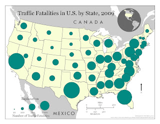
The proportional symbol map quite simply uses symbols that are proportional to the data being displayed. For example, if the symbol being used was a circle then a larger circle would indicate a larger value of the date, whereas a smaller circle would indicate a smaller value. Any sort of symbol can be used on this type of map, such as a circle, a square, or even a symbol specifically related to the data being considered. In the example shown above, circles of varying sizes are used to show the number of traffic fatalities in each state in 2009. As is shown, the larger the circle is the more fatalities that state had in that year.


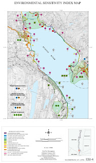
Finally, the environmental sensitivity map shows the environmental and cultural aspects in a specific region. This type of map takes multiple datasets and combines them into one to show the areas of a region most sensitive to development due to the resources or other assets present. These assets can include anything from national parks to simply biodiversity.  The environmental sensitivity map above shows the Hudson River in New York.  While a bit difficult to see due to size, this map shows the different species found around this river, as well as the different human resources that can be found.

In addition, here is a video from National Geographic that shows the destructive powers of a hurricane.


Sources:

“Environmental Sensitivity Mapping." British Geological Survey (BGS). Web. 04 Sept. 2012. <http://www.bgs.ac.uk/mineralsuk/sustainability/mapping.html>.

"Neighborhood Statistics." Office for National Statistics. Web. <http://www.neighbourhood.statistics.gov.uk/HTMLDocs/images/Statistical%20Maps%20-%20Best%20Practice%20v5_tcm97-51126.pdf>.

"Types of Thematic Maps." Types of Thematic Maps. Web. 04 Sept. 2012. http://srufaculty.sru.edu/james.hughes/100/100-1/d-1-12.htm